

The goal of this project was to improve the alumni giving experience through redesigning the HBS giving website.
My Roles
Information Architecture Design | Navigation Design | Wireframe Design

For IA, 40 is better than 65
By synthesizing qualitative and qualitative research we were able to cut the number of pages across the site down from 65 to 40, without sacrificing any content.
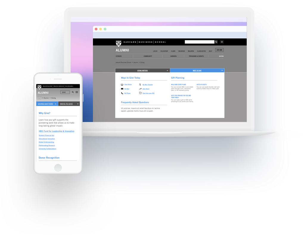
Three levels of navigation in one menu
We replaced an old breadcrumb navigation with a megamenu, allowing users to navigate anywhere within the giving site from one of two menus.
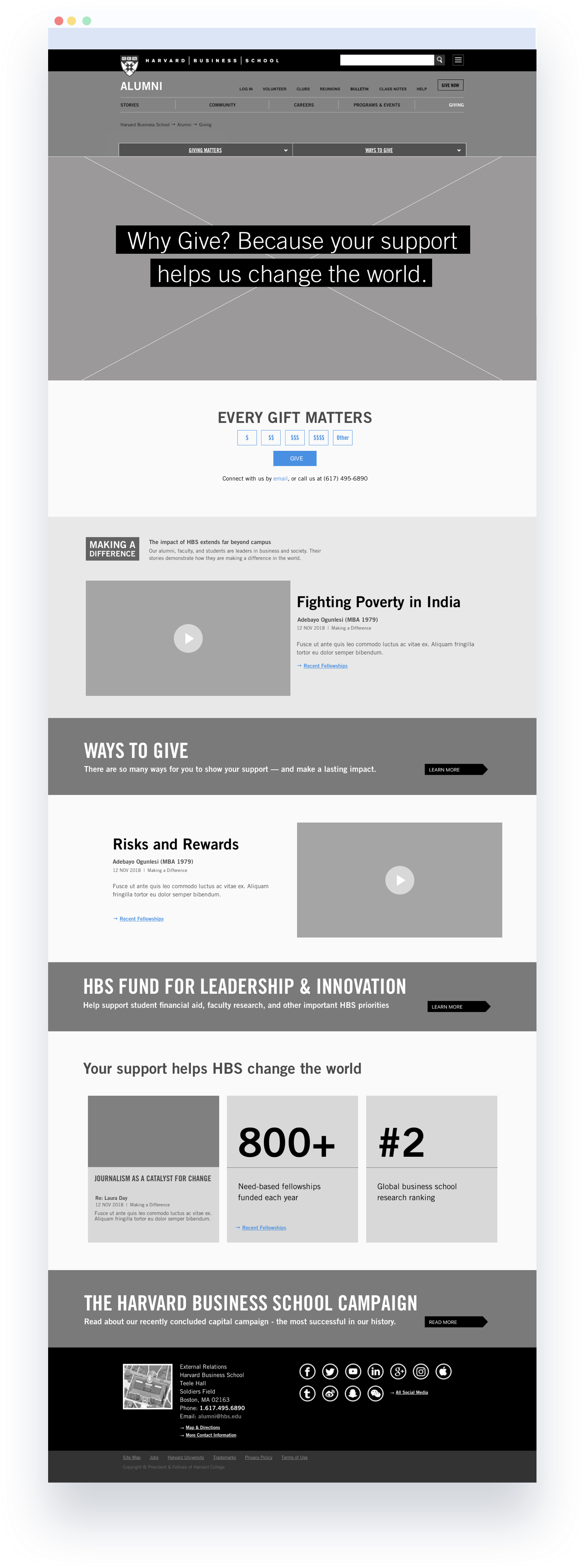
Building atomically
A collection of modules built from standardized design elements made the final step of creating wireframes for a clickable prototype consistent and easy to execute on across 34 initial mobile and desktop screens.
Key insigts learned through the design process included
Stories aren't as important as actions. Users of the HBS giving site are really only interested in giving as quickly and painlessly as possible, or in learning about how to plan for complicated gifts. The redesign focused heavily on removing unneeded, and unwanted features.
Plain speak wins. Research exercises like card sorting helped us to understand that labeling articles about complicated gift types using plain speak language would be much more helpful to users who are trying to learn more about these types of gifts (do you know what a Charitable Annuity Trust is? If no, the new HBS giving site will be a much better experience for you).