Liberty Mutual Homepage and Navigation Redesign
At Liberty Mutual, I sat on two teams separately focused on improving the experiences of users starting a quote or accessing their account. Both of those groups saw improving the homepage as key to improving the experience they were responsible for, but neither were working together to solve these challenges. Seeing this problem, I organized and facilitated a week-long design sprint to get the teams working together. The redesigned homepage resulted in a $1.5 million annual increase in policies sold.
My roles
Visual design lead, UX research, UX design, testing strategy
Other people’s roles
Content strategy: Jason Bushey | Development: Joseph Sentongo, Sukesh Reddy, Gokhan Morkoc, John Bolanos | Business strategy: Viola Pilika, Katie Gu
Tactics I used
Design sprint facilitation
Customer interviews and session replay for quantitative research
Click tracking for quantitative research
Stakeholder mapping
Design from low to high fidelity
Coordination with devs to see work implemented as designed in scrum
Results
$1.5 million increase annually in policies sold
3.6% drop in bounce rate
2% increase in sign-in rate, improving digital adoption and reducing operations cost
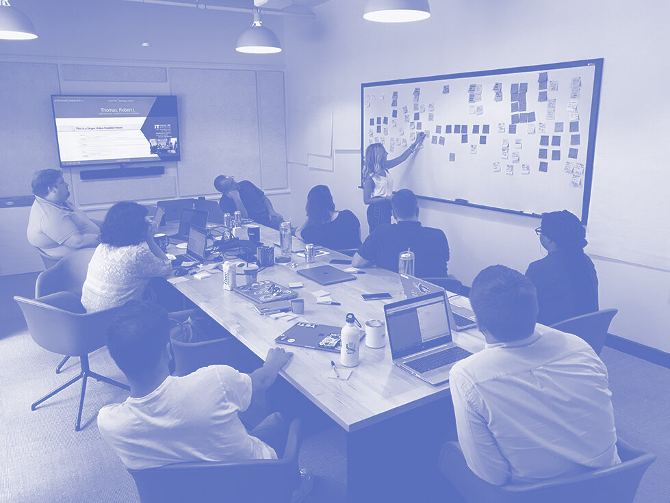
The sprint
The first challenge in this effort was just making a case that the juice would be worth the squeeze. Getting six developers, two product managers, and three designers to dedicate a full week to solving a problem takes a lot of convincing. Through several careful conversations, I was able to lay out the business opportunity for working together on one problem, stepping away from the recurring meetings that frequently stood in the way of either team gaining much ground.
Once the case was made, I focused on scheduling out the sprint. This meant pulling the team in to recruit experts, schedule customer interviews, order food, and reserve a room.
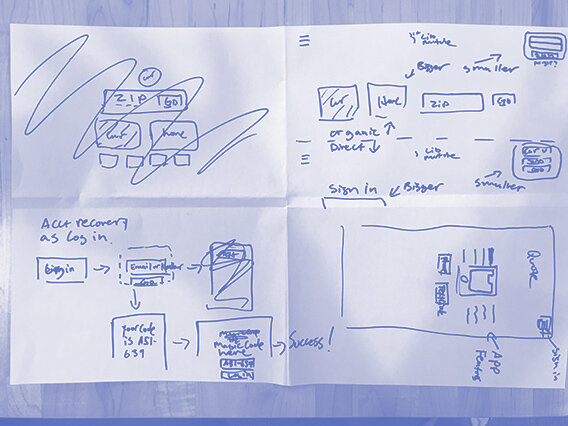
Interviews led to observations, which led to negotiations of priorities and ultimately prototyping of features. One important piece of data rose to the top early and guided a lot of our decisions: upwards of 50% of users weren't engaging with the homepage's two primary actions of logging in or quoting.
The team ultimately agreed that we would focus on two guiding heuristics in our design with a goal of improving successful logins and quotes.
1. Reduce the unnecessary
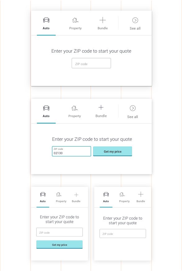
Our first heuristic, to reduce the unnecessary, was aimed at reducing cognitive load wherever possible. We sought to simplify paths into quoting and logging in through reducing clicks and questions because we knew that, with around 25k unique visitors a day, any marginal reduction in friction could have enormous effects on people sticking with the experience. As I started to audit the component customers start quotes with, there were three major design challenges I sought to solve.
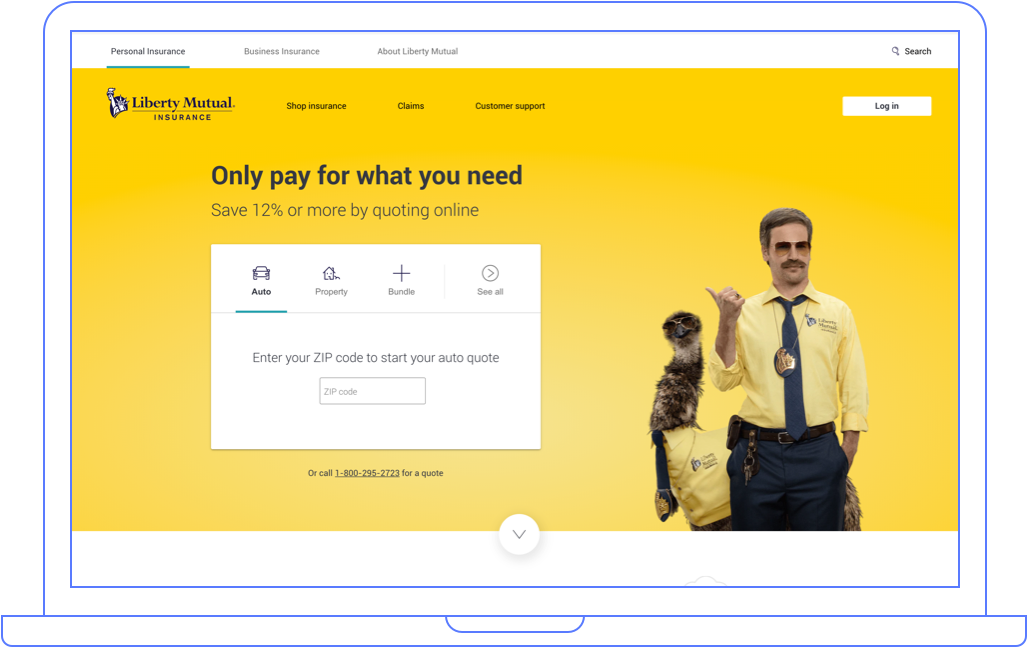
Problem: On the old page there were four types of insurance a customer could select, each the same size and with similar visual weight. We also knew that, overwhelmingly, customers came to get a quote for car insurance.
Solution: Our solution was to structure the component as a card with a tabbed navigation. Each type of insurance is a tab on the card, which defaults the user to get a quote on auto. This saves a large portion of users from ever having to decide what type of insurance to select.
Problem: Although only 3% of users ever opt to bundle a policy with another line of type of insurance, every user was required to decide whether to bundle several policies together in the quoting component because it was presented as a question in the flow.
Solution: Placing bundled policies as a specific tab in the quoting component allowed us to save those who weren’t interested in this option from having to decide, while still creating a pathway for users who were interested in purchasing this way.
Problem: Through watching session replay of the old quoting component, I noticed that lots of people were clicking on the main CTA to move into the quoting questionnaire before entering their ZIP code, getting an error, and bouncing from the page.
Solution: Waiting to reveal the quote button until a user successfully entering in the ZIP code allowed us to remove the option for this mistake.
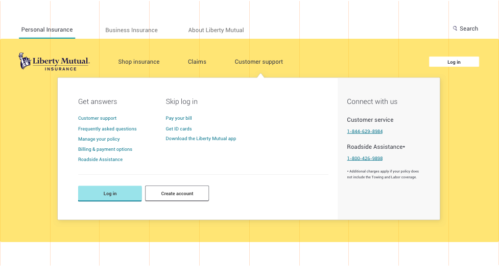
2. Provide focus on primary actions
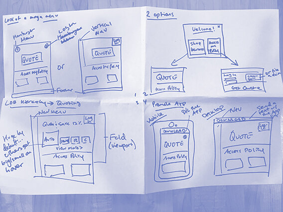
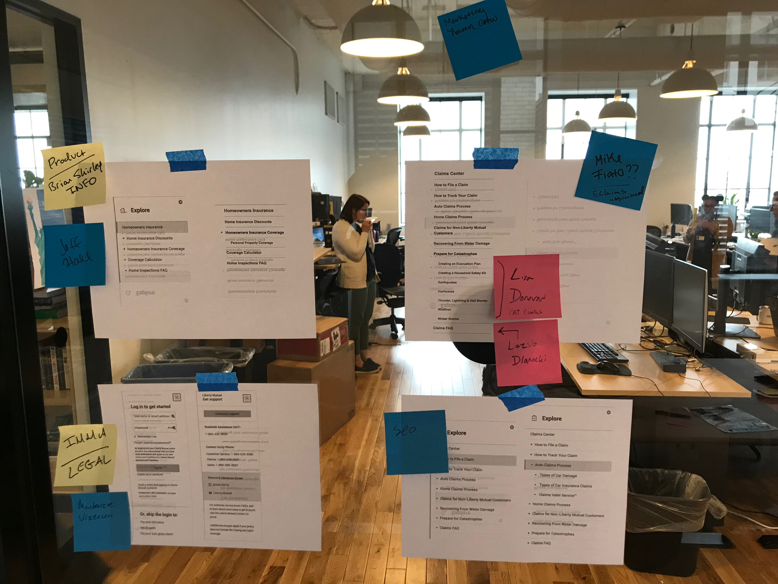
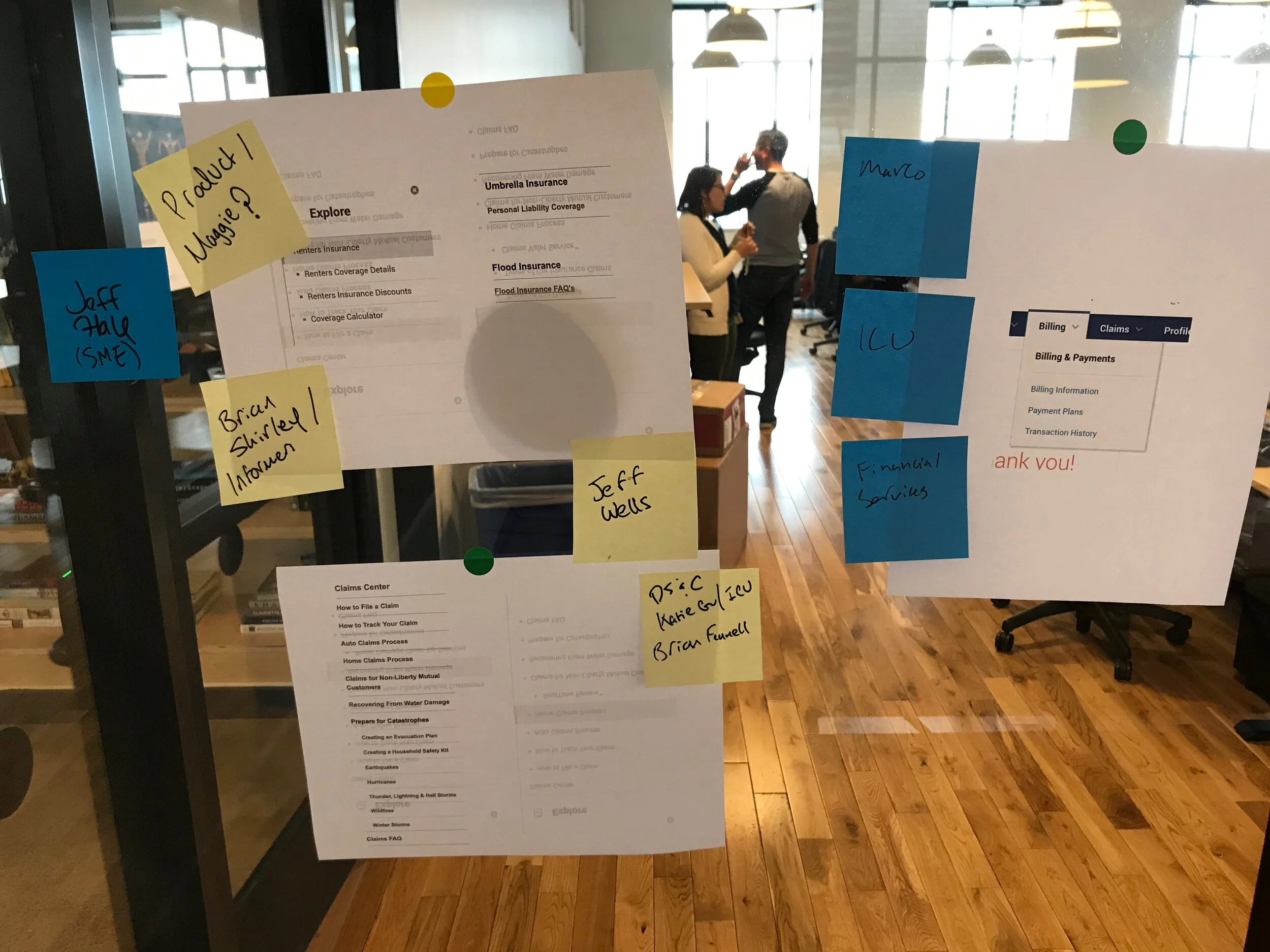
Creating focus on the homepage of a company like Liberty is as much an organizational and political challenge as it is a design challenge. Nowhere is this more typically the case than in a product's navigation. The temptation to jam everyone's thing in the navigation is a pernicious one, and often one that is detrimental to users. We noticed, through watching session replay, that many users were triggering the mega menu, and either bouncing or going to other pages in the site that they would ultimately bounce from. My design solution was to make several big tweaks to the navigation. Before making design decisions, I facilitated a workshop to identify key stakeholders across Liberty Mutual who might be concerned with what links exist in the main navigation. For the workshop, I invited designers and product managers from across the organization - in the end we were able to identify stakeholders for the website navigation, and also for the navigation of the customer app. This was critical for communication as we circulated changes and created buy-in for the new design.


Providing clear customer pathways through improved navigation
Problem: A review of our analytics showed that users who navigated through the site had a higher likelihood of bouncing. Users who didn’t navigate tended to quote at higher rates and sign in more successfully.
Solution: To ensure that only the people who needed to navigate were navigating, we required that the menu be trigged with a click on desktop. This is unusual behavior for a megamenu but worked well for our use case because it decreased the number of times it appears people accidentally trigger the menu and begin navigating through the site.
Problem: Visually, the menu had previously been designed to stretch the width a to stretch the width of the browser. The background of the menu was white, and frequently the bottom would border next to white elements on the page. This was disorienting and made it hard to see where the menu started and stopped.
Solution: I redesigned the menus themselves to only stretch the max width of the site, leaving a border of 64 px at all times, and to have a light drop shadow.
Problem: The labels for the menus were also generic and problematic. The main navigation featured menus like “Resources” and “Products”. Resources is fairly ambiguous and contained links to pages like “Commercials” and “Calculators”, and research showed consistently that people don’t typically think about insurance as a “Product”. They think of it as a service.
Solution: I reorganized the labels and gave them more accurate names. I removed “Resources” all together and moved most of those items under a new menu, “Customer Support”. I also changed “Products” into “Shop Insurance”. The verb-based navigation helped users understand what they would find under the menu. With the saved space from removing “Resources” we created a larger “Log In” button that allowed users to log in directly from the homepage.
Improving the partnership between Engineering and Design
User testing validated our design and gave us the mandate to continue our work. The development work for this project was unique, because there were multiple squads working on it at the same time. To keep multiple dev teams aligned I instituted a weekly standup with all the developers, where we could see their work checked into the dev environment at the same time. This allowed us to quickly see inconsistencies in code that resulted in visual breakdowns on the page.