Liberty Mutual Website Replatform
When I joined, Liberty Mutual’s website was managed on a CMS so complex and outdated it required an entire team just to update pages on the site. I worked with a group of developers and product managers to make the case to both build our own internal CMS from the ground up, and design it in a way that would let us update the site with components in alignment to Liberty Mutual’s design system. This allowed us to cut the cord with our old CMS and launch a completely rebuilt, highly performant website, while feeding and refining our design system with new components. Overall, this has saved Liberty Mutual $6 million annually.
My roles
UX research, UX design lead, visual design lead
Other people’s roles
Content strategy: Jason Bushey | Development: Christopher Snyder, Aaron Belanger, Nate Scholnick, Rodney Phillips, Michael Lessard | Business strategy: Megan Wojtkun
Tactics I used
Facilitated interdisciplinary hackathon to test the first version of the CMS - which was built from scratch with heavy input from UX.
Led weeklong design workshop to design initial templates and layouts
Interpreted from and contributed to company design system through creation of new components
Fully redesigned 90% of the sites pages, and played a supporting role in the redesign of the remaining 10%
Results
Increased page performance by 40%
Reduced the number of components used from 97 to 60
Overall, $6 million in savings for Liberty Mutual
The importance of quick work

At the beginning of a project this large there are a lot of hypotheses to validate. We understood that a cornerstone to our effort was the assumption that publishing to our new CMS would be crucial. It wasn't going to look or operate like Squarespace at first, so we needed non-technical team members to understand the flow and technical requirements for creating and updating pages.
As a foundation, I had mapped out a task flow that users at Liberty would need to go through in order to work within our new CMS. To make sure that this flow was something team mates would actually adopt and understand, my content strategist and I scheduled a day long hackathon to rebuild and republish our existing product pages all at once. We invited developers (who understood the technical requirements), along with product managers and other designers.
We ended up identifying bugs with our system that we fixed quickly and successfully on-boarded the whole team in an environment where they could understand who the experts in the room were. This was helpful down the road when people needed help updating pages in the new CMS.
By the end of this first hackathon, we published ten new pages. A small win, but, for comparison, it would have taken at least a week to build and publish ten new pages in our old content management system. The hackathon had the added benefit of instantly boosting the percent of traffic seeing pages built on our new CMS - which was crucial for building confidence in senior management.
Thinking atomically
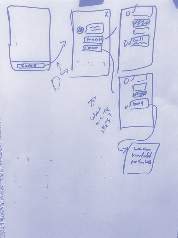
To scale design across the whole site, my goal was to think as much about shared components as possible. My first step was to set aside a week with another designer and content strategist to sketch, and design in low fidelity, all the layouts we knew we would need to support the content we knew we had.
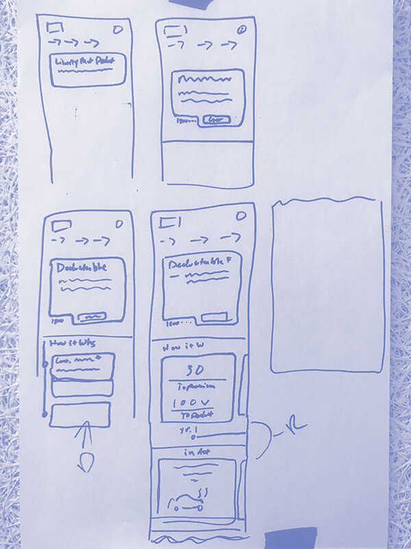
This broke from our normal rhythm of working on embedded squads, and required some convincing for product management. But the end result was creating a shared understanding of what components and layouts we'd need to support the rebuilding of our website.
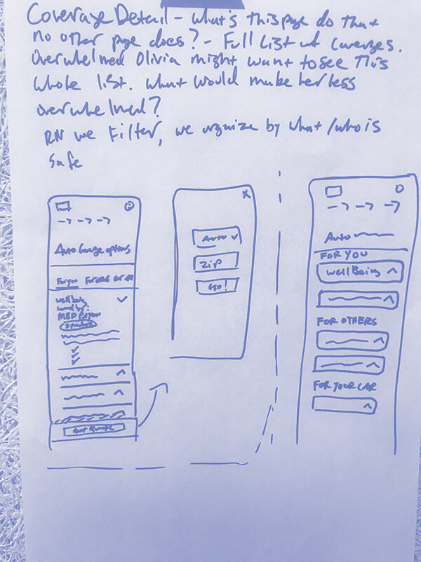
Auditing components
Before designing for high fidelity, I conducted an audit of the components we had used on the website up to that point. We identified duplicative components and were able to reduce the overall number of components used from 97 to 60. There were only a few components we brought into the site from the previous design, but this audit was key in helping us identify where we had experienced feature creep and gave us a strategy for preventing it in the future.
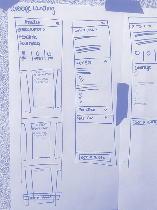
After our initial design hackathon, I broke each component into its own design, and assigned components to the layouts that needed them.
The end result was that we both interpreted the Liberty Mutual design system, and contributed back to it with components that made sense for our unique stage in the experience.
The handoff
Through focusing on aligning design across a handful of our most trafficked pages, we were able to share designs that covered over 90% of our traffic. We capped off a week of design with a large meeting between all the devs for our squads invited. I answered questions and identified gaps in the design and the technology. Probably the most important outcome of that meeting was realizing that we could build out CSV files with content for templates that were used on 130 pages and build those pages in the CMS all at once.