Safeco Website Redesign
In July of 2020, my team was asked to redesign Safeco Insurance's entire website. We had one quarter to do the work, and everything needed to be done remotely. To accomplish the work in such a short period of time we created quick alignment with stakeholders through interviewing both them and the independent agents who rely on the site for business. Quick work on the design was the result of several early, focused design mobbing sessions where we identified core patterns and templates that would allow us to scale the design across the whole site.
My roles
UX Research, UX Design Lead, Visual Design Lead
Other people’s roles
Content strategy: Jason Bushey | Development: Christopher Snyder, Aaron Belanger, Nate Scholnick, Rodney Phillips, Michael Lessard | Business strategy: Megan Wojtkun
Tactics I used
Facilitated remote user research
Led weeklong remote design hackathon to design all layouts
Interpreted from and contributed to company design system
Worked with engineering to publish similar pages in bulk using templated layouts
Results
Full website redesign in one quarter
90% reduction in number of components, resulting in much faster page speed and lower tech and design debt
Research
Most of the team members understood that research would be important to the process, but initially opinions varied with regards to how much. Early on I set time aside to meet with two UX researchers to discuss a plan. I made the case that we could likely get the qualitative data we needed from between five and ten initial interviews. At least five needed to be agents working in the field, and then several more needed to come from the business to help us understand how they were relying on the website. I felt it was most important to talk with independent agents because they had the closest connection to customers. Interviewing actual customers for this project wasn't feasible, unfortunately, because of the time required to recruit research participants who are Safeco customers.
While the UX research team began to put together moderator guides and recruit participants, I focused on diving into our analytics. One very interesting point of data I observed was that the log in page for Safeco was getting around triple the traffic the homepage was getting. Further cementing the importance of the site needing to serve as a gateway to customer's accounts was the fact that around 80% of visitors to the homepage clicked on the Log In button in the navigation.
Interviews with agents and Safeco employees further emphasized the importance of shaping the site around helping current customers with their accounts. Even the CEO of Safeco felt that the primary use case of the site should be helping customers manage their account digitally.
To the extent that the site was used as a sales tool, it was primarily a tool agents would pull out when on the phone or in person with a potential customer. Very few people came to the site organically and just tried to get a policy. So we tried to tailor all of the content, but the product pages in particular, to highlight the importance of agents in the customer experience for Safeco customers and to provide those agents with content that would enable them to explain complicated concepts while having conversations with customers.
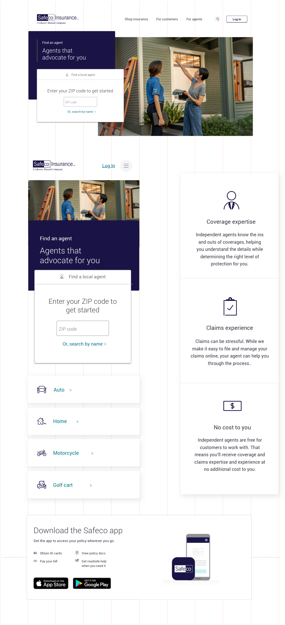
Designing to scale quickly

Because of the mobbing session I coordinated, we were able to align on thirteen page layouts, covering 100% of the site, all remotely.
Having worked on large scale projects before, I knew I needed to pull other product designers into the work if we were going to meet our deadline. I also knew that there was a risk in our work getting out of sync. I sought to solve this challenge in two ways. First, I organized a weeklong mobbing session with two other designers to put together an initial set of templates. Doing this remotely was pretty straightforward using Freehand. This allowed us to get pretty close to the same visual styling in a really short period of time. We saw where we were using similar components, and decided on which ones to move forward with.
Second, we stored all of our work in a tool called Abstract. Introducing Abstract into our toolkit was something I worked for around a year to do at Liberty. This Safeco design was one of the first times we really saw the usefulness of the tool come into bloom. It allowed us to work from the same set of files, and for me to come in after the initial work was done and clean up styles so that all the template types were in sync with one another.
An important part of our approach was knowing that our dev team also only had one quarter to rebuild the whole site. So I tried to reuse components I knew they'd need to build wherever possible. Abstract allowed me to do this more easily than if we had just been passing Sketch files back and forth over Slack.
Early in the design process I also spent time with key developers and realized we could make the launch much easier if we could apply the same content types to similar pages. We tried to design in a way that would allow us to publish multiple pages at the same time, by linking a CSV file to our page templates.
Results
The new site won't be launched until Q1 of 2021, but there are a few great things we already know.
First, we used around a tenth of the number of original components the old site had, which will reduce design and tech debt, and free the team to focus on higher impact work.
Second, the new components are in alignment with our design system, further reducing the weight of the pages, improving SEO and the customer experience generally.
Third, we were able to align Safeco business leaders on what the primary purpose of their site should be, which will make future decisions around iteration easier.
Finally, the new design will sit on a CMS that will allow Safeco employees to make updates, reducing the need for middle people on my team to make simple updates and freeing us up to design new experiences.